Tax Freedom Day
Live Demo: http://interactivethings.github.com/make-opendata-finance/map.html
Recently, various media published results of the ESTV (Eidgenössische Steuerverwaltung) which show the so-called “Tax Freedom Day”, the day of the year when a citizen has earned enough money to compensate for the taxes he/she paid. Many of you probably heard of this.
The idea of this project is thus to craft an interactive, thematic map/visualization of this data, possibly realized with state-of-the-art web technology such as D3.js. The visualization should allow the viewer a quick, informative and salient overview of the spatial disparities in the Swiss tax system.
Data
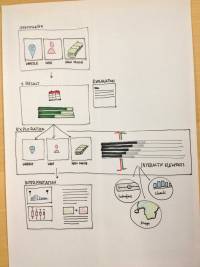
There is one continuous date variable (the day one compensates taxes), and two factors, form of living (family, kids, etc.) and yearly income. The spatial variable is the township where one lives, accompanied by a BFS-number which can be used to easily link the township name to (SVG) polygons used for rendering the map.
Vis Details
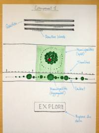
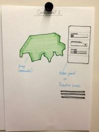
The entities (the townships with their respective compensation dates) could be visualized as appropriately coloured polygons on a simple map (e.g. a colour scale from green to red for early dates and late dats respectively ). To introduce animation, the rendering/introduction of the polygons could be timed according to their compensation dates. There should be a switch where the user can toggle form of living (factor 1) and a draggable scale bar where the user can set the amount of yearly income (factor 2). The map would either update automatically or upon pressing a button.
Many more combinations/ideas are possible!
Team
Links
- for data, see above
<GITHUB interactivethings/make-opendata-finance>


